
British-Norwegian Chamber of Commerce
Levelling up the Chamber’s brand
When we first met the British-Norwegian Chamber of Commerce (BNCC), their brand didn’t reflect the weight of their mission.
For an organisation connecting business communities across two powerhouse economies, their visual presence looked improvised and outdated. The Chamber needed an identity as modern and versatile as the network they represent.

The Challenge
BNCC’s channels told different stories: LinkedIn posts got little engagement, emails looked messy, and the logo never had a proper final version. With no clear rules for colours, typefaces, or usage, the Chamber relied on external team who needed clear guidelines. The result was a patchwork brand that made it harder to build trust with members and partners.

The Solution
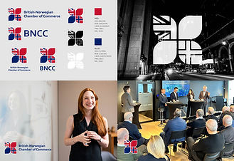
We refreshed their logo to be clean, modern, scalable, and instantly recognisable. Then we built a system of colours, shapes, and logo variations that could adapt to any use. To keep it consistent, we created hands-on brand guidelines with real-world examples for campaigns, events, and networking activities.
The Result
BNCC now speaks with one clear voice across every channel. Their LinkedIn content stands out in the feed, and event attendance has risen by around 35%. More importantly, their communications now reflect the professionalism of the Chamber itself. It is building trust, attracting members, and making their network stronger.
A stronger identity, a stronger Chamber
With a solid brand system in place, BNCC’s team (and any external partners) can work confidently, knowing the identity supports their mission. The Chamber is now as recognisable online as it is influential offline.
